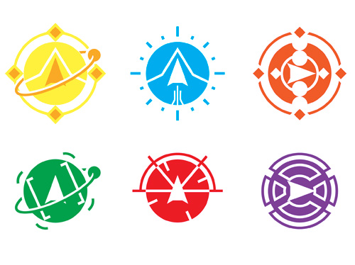
A collections of logos, these symbols represent the different roles and positions abord the Artemis, a spaceship bridge simulator in the vein of Star Trek. From the upper left to the lower right, the symbols represent the roles of Captain, Helm, Engineer, Science, Weapons, and Communications.
Client: Destination Earth
Year: 2013
Medium: Adobe Illustrator![]()

In 2011, the Long Beach Ukulele Club made an open plea for designers to create a new logo for their organization. Utilizing the distinctive headstock of the ukulele and the colors of the City of Long Beach, I placed the setting of the instrument along the water while the sun was setting. As of the beginning of February, this logo, in its second revision, is the front runner. A final decision is forthcoming.
Client: Long Beach Ukulele Club
Year: 2012
Medium: Adobe Illustrator![]()

I created this logo in 2005 for the Star Wars charity line-up in Hollywood, CA. Organized by the Star Wars fans known as Liningup.net, the group went on to raise more than $100,000 for the Starlight Starbright Children's Foundation over the course of the three charity events, beginning in 1999.
Client: Liningup.net
Year: 2005
Medium: Adobe Illustrator![]()

During my employment with The Miller Family Companies, a separate side project was forming and I was requested to name and design the logo for this environmentally designed, internationally focused, housing construction project. Using the concept of circles imparted to me by the founders, I incorporated the Earth and the colors green and blue to represent the environmental aspects, as well as using the macron diacritic over the o in the shortened word "Hōm" to emphasize the international aspect, as well as clarify the pronunciation.
Client: Global Hōm
Year: 2010
Medium: Adobe Illustrator![]()

A commissioned piece, the LA Viking Rats logo is intented to represent a fictional rugby team. This is an original work based off of the concept of nothing more than the description "viking rats" and was utilized for one of the items necessary for an online scavenger hunt (GISHWHES).
Client: Jonner Purinton
Year: 2013
Medium: Adobe Illustrator![]()

Another independent side project for one of the founders of The Miller Family Companies, I was requested to design and have printed portfolio folders to ExpressPark, a company related to computerizing the management and acquisition of parking spaces throughout the country. Utilizing the company's colors of blue and orange, I created a vector representation of a parking structure without cars, to highlight the open possibilities of utilizing such a service.
Client: Express Park
Year: 2009
Medium: Adobe Illustrator![]()

One of the earliest design projects during my educations was for a fictional company called "Coffee & Cookies" With the requirements of a logo designed in Adobe Flash that could withstand the contrast of both a dark and a light background, I saw the average customer dipping their cookies in their coffee and drew upon the warmer of the brown colors of both products. Contrasting angled shapes behind the curved aspects of the product allowed for a contrast and focus on the product itself from whatever environment it may have been placed in.
Client: DeVry University
Year: 2011
Medium: Adobe Flash![]()

While assisting with the administration of the website for the Euro-board gaming group that I am a member of, I designed this header to incorporate many of the symbols and pieces of games that members of the group would come across. The three dimensional effect was used to give the page itself some depth in an attempt to bring more life to the mostly text based design of the time.
Client: LA Games - Board Game Group
Year: 2008
Medium: Adobe Illustrator![]()

In an assignment to incorporate our identity into a logo for our potential self-directed business, I utilized the image of the Pen Tool from Adobe Illustrator to represent the negative space between my initials. I opted for a clean, single layered, black and white design to represent the logo style that I perceived as my style at the time. This logo is utilized currently on my business cards and resumé.
Client: DeVry University
Year: 2011
Medium: Adobe Illustrator![]()


